



Support
A recruitment platform for 12th Corps Military Org — a public website and the admin panel that runs it.
- Location:
- Ukraine
- Date:
- February – June 2026
- Industry:
- Military
- My role:
- Managing UX/UI Designer
- Type:
- Website and Admin panel
- Tools:
-
-
Problem statement
Problem — to build a recruitment platform from scratch that would help candidates easily find military-related job openings that match their skills, apply for positions, or request transfers without unnecessary complications. The project involved developing a website for the corps and creating an administrative control panel that would enable quick content management from anywhere for users of any age and technical proficiency.
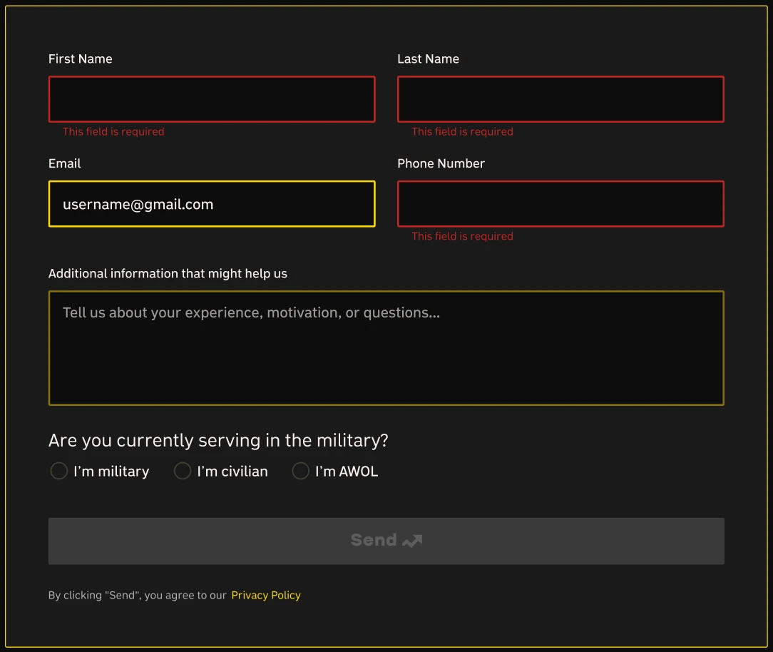
Solution — before starting design, we validated our hypotheses with a business analyst. I suggested displaying the last updated time in the top tabs to make it easier for admins to see when the site was last updated. I also suggested adding a confirmation prompt before deleting a job posting. And a couple more decisions that made it into the release: for the website, a distinction between support and military job openings, and a quick application form.
My role:
I worked as the managing UX/UI designer alongside a business analyst and developers, taking it from research to a released design that stays simple for admins of any age to keep up to date.
The website
The audience is mostly Ukrainian men aged 25 to 55, so the site had to work for every age group, not one. The goal was clear: vacancies and a fast way to apply.
A dark, high-contrast base with a single gold accent — disciplined, serious, unmistakably military — carried by documentary front-line photography and the brigades’ own insignia.
Palette
- #0D0D0D Surface/Main
- #1A1A1A #1A1E1D Surface/Card-Job
- #FFD700 Primary/Yellow
- #F9EFEC CTA Background
Principles
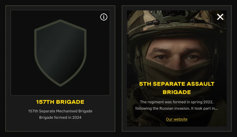
- Brigade emblems as the identity anchor
- Documentary photography, never stock
- Angular, insignia-like geometry
Type
- Ermilov Bold — display
- Road UI — interface
Four paths, one fast application.
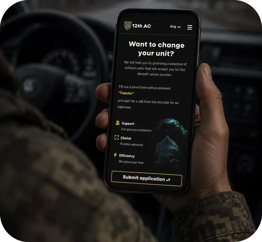
The site is built around how a person joins: civilian roles, military roles, transfer from another unit, and the 18–24 contract. Each path is its own clear entry point, but all of them lead to one short application.
The priority was getting to the application, not telling everything.
The goal wasn’t to dump information — it was to move a person from interest to application in the fewest steps. So applying is brought to the front, not buried at the end.
Result.
A working recruitment site with four entry paths and a fast apply flow.
UI-Kit
A build-ready kit, not decoration. Every component ships with its real states — default, error, filled and empty — alongside the animated ones the live site runs, so there was no guesswork in build. All of it speaks one language: dark, high-contrast, insignia-sharp — so the whole recruitment site reads as a single system.
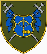
Corps card From this file
- Type
- Outline
- State
- Default
- Size
- L
404
On a recruitment site, a dead end is a lost recruit. So instead of a blank wall, the not-found page stays fully on-brand and gives one clear way out — straight back to the home page, where every path to applying starts.
And the gold reticle scans the screen as if searching for the target that isn’t there — the military tone, carried right into a 404.
The site goes live soon.
The admin panel
The admin panel had to work for everyone who enters data — at a desk in the office and on the move outside it. So we couldn’t design for one calm, ideal scenario: we validated both the happy path and the edge cases, and built what would actually hold up in those conditions.
Nothing here was decided on taste alone: every choice answered one question — does this help someone enter the right data faster, with less chance of error?
I deliberately chose not to build a full-fledged design system — for the internal dashboard, it would have taken more time than its scale warranted. Instead, I put together a single-page UI kit: components, states, and rules. This was enough for the developer to confidently build the interface, and I didn’t spend weeks on a system that this project didn’t need.
-
Last edit, right in the tabs
I added a “last updated” time to the top-level tabs, so an admin can see at a glance when each section was last touched — no guessing whether what’s live is still current.
-
A confirmation before a delete
Removing a vacancy now asks for confirmation first, so a single accidental click can’t wipe a posting the corps still needs.
Result: a working panel that lets admins update the site quickly on their own.